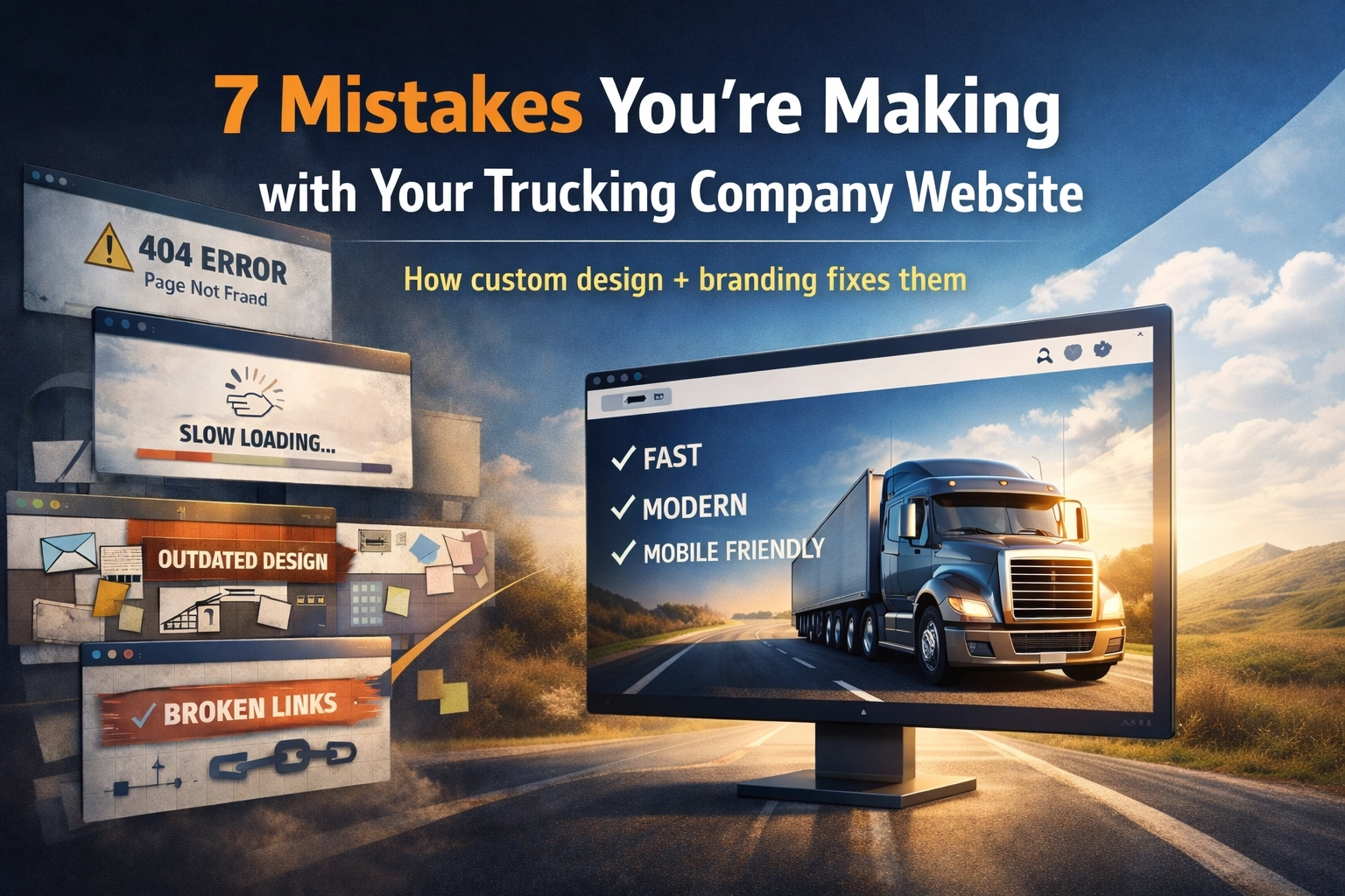
Your trucking company website should be working as hard as your fleet. But if you're using a cookie-cutter template from 2018 or a site that hasn't been updated since the last fuel price spike, you're leaving money on the table.
In 2026, shippers expect instant quotes, real-time capacity updates, and seamless digital experiences. Drivers want to apply for jobs from their phones in under three minutes. Your competitors who've embraced custom trucking company website design and strong branding are already winning this business.
Let's break down the seven biggest mistakes we see trucking companies making with their websites: and how modern, custom-built design and branded strategy solve each one.
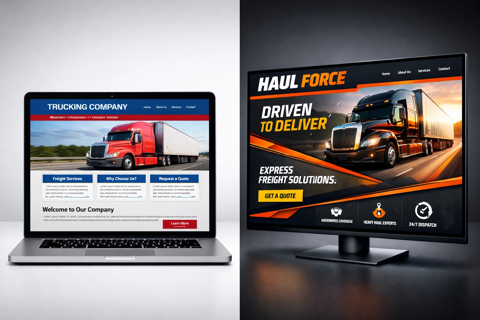
Mistake #1: Your Website Looks Like Every Other Trucking Site
You know the template. Blue and red color scheme. Generic semi-truck stock photo at the top. A tagline about "delivering excellence" or "your trusted partner on the road." Three icons representing Safety, Reliability, and Service.
This template approach kills your differentiation before prospects even read your first paragraph.
How Custom Design & Branding Fix It: A custom-built website (never a template) tells your company’s real story. Your colors, typography, photography style, messaging, and layout should match how you actually operate and who you want to attract. Strong branding also lets you speak clearly to different audiences (shippers, drivers, owner-operators) with the right content and calls-to-action, without turning your homepage into a one-size-fits-all billboard.
Mistake #2: Zero Real-Time Visibility Into Your Capacity
Shippers are checking your website at 11 PM on a Sunday because they need a truck by Tuesday morning. If your site just says "Contact us for a quote," you've already lost them to a competitor with instant capacity visibility.
How Custom Design & Strategy Fix It: Your site should be built around how shippers actually buy. That means clear service areas, equipment types, lanes, and “what happens next” messaging that removes friction. With the right integrations (TMS/CRM/email + routing rules), you can capture the right details up front and send urgent requests to the right person fast: even after hours.
Mistake #3: Your Driver Recruitment Page Is a Career Black Hole
Your "Drivers Wanted" page has a PDF application that requires downloading, printing, filling out by hand, and mailing back. Or it's a 47-field form that takes 20 minutes to complete on mobile. Either way, you're losing qualified drivers to companies that make applying feel like ordering from Amazon.
How Custom Design & Branding Fix It: Build a mobile-first recruiting experience with a clear, branded flow: job details that are easy to scan, trust builders (pay transparency, equipment photos, benefits, home-time specifics), and a short application that can be completed fast. The goal is simple: reduce steps, increase confidence, and get drivers from “interested” to “scheduled” without friction.
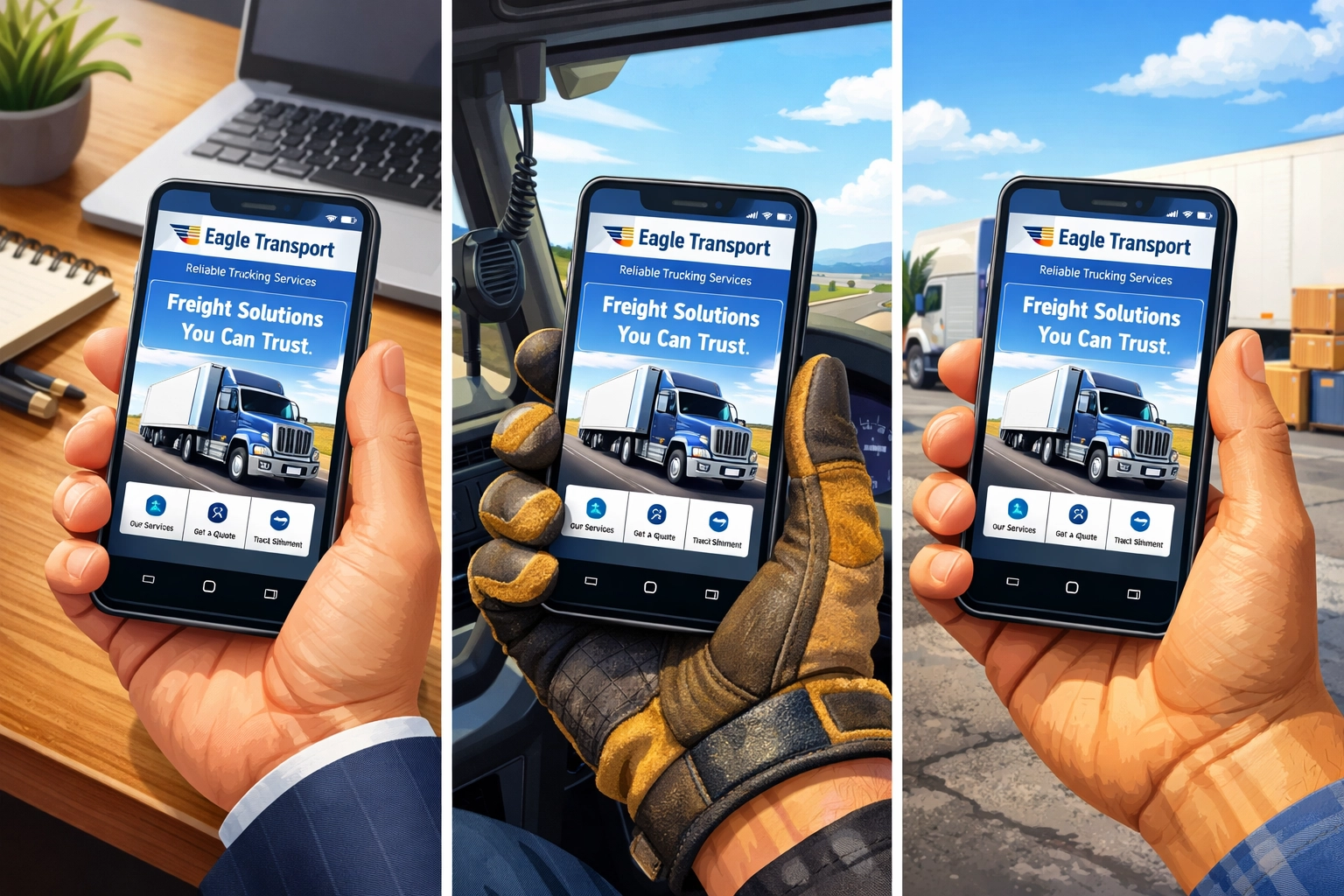
Mistake #4: Your Mobile Experience Is an Afterthought
Over 70% of traffic to trucking websites now comes from mobile devices. Drivers are researching jobs during their 30-minute breaks. Shippers are comparing carriers from their phones between meetings. Yet many trucking sites still have tiny buttons, unreadable text, and forms that break on mobile screens.
How Custom Design Fixes It: Modern logistics marketing starts with mobile-first design, not desktop-first with mobile as an afterthought. A custom build lets you design around real user actions (tap-to-call, quick-apply, quote requests, lane info, location/map actions) with clean typography, thumb-friendly buttons, and forms that actually work on small screens. Fast load speed and a streamlined layout do more for conversions than any flashy feature.
Mistake #5: You're Still Manually Responding to Every Customer Inquiry
A shipper fills out your contact form asking about LTL rates to Phoenix. It sits in your general inbox for six hours. By the time someone responds, they've already booked with a carrier who answered in six minutes.
How Custom Design & Workflow Fix It: A better website doesn’t just collect messages, it routes them. Well-designed forms ask the right questions (service type, lane, equipment, pickup date, commodity) and send the lead to the right person immediately based on your internal process. Tie it into your CRM/email notifications so your team can respond fast and consistently.
This isn't about replacing your team: it's about making them more efficient. Your sales people should spend time closing deals, not copy-pasting rate sheets.

Mistake #6: Your Website Has No Clear Next Step (So People Bounce)
Think “Contact Us” is enough? The impersonal experience is making someone hunt for answers, then guess what to do next. If your site doesn’t guide visitors with clear CTAs, they leave and go to a carrier that makes it easy.
How Custom Design & Branding Fix It: A branded site should make the next step obvious for each visitor type: “Request a Quote,” “Apply Now,” “Book a Call,” “Track a Shipment,” or “Become a Partner.” Clear page structure, strong messaging, and trust builders (authority, safety, testimonials, certifications, equipment, coverage map) reduce hesitation and increase conversions. If you want live help, a simple staffed chat or contact option can work: the key is clarity and speed, not buzzwords.
Mistake #7: Your Content Never Changes
Your homepage looks identical on Tuesday as it did six months ago. There's no reason for visitors to come back. No demonstration that your company is active, growing, or paying attention to industry changes.
How Custom Design & Branding Fix It: Build your site with intentional “freshness” baked in: featured lanes, recent wins, safety milestones, new equipment, driver spotlights, and updated testimonials. Even simple, consistent updates signal that your operation is active and trustworthy. A branded content plan (not just random posts) gives you a reason to update pages regularly and keeps your messaging aligned across shippers and recruiting.
This creates a living, breathing website that builds trust through consistent activity rather than a static brochure that screams "we set this up once and forgot about it."
The Bottom Line: Your Website Should Drive Business, Not Just Describe It
These seven mistakes share a common theme: treating your website like a digital business card instead of your hardest-working sales tool.
Custom trucking company website design paired with strong branding transforms your site from passive to persuasive. It makes your company look like the obvious choice. It guides shippers and drivers to the right next step. It builds trust fast, communicates value clearly, and helps your team spend less time chasing low-quality leads.
Most importantly, it frees your team to focus on what they do best: building relationships, solving complex logistics challenges, and growing your business: instead of fighting a site that doesn’t reflect who you are.
The trucking companies winning in 2026 aren't just moving freight efficiently. They're delivering digital experiences that match. If your website is making any of these seven mistakes, you're competing with one hand tied behind your back.
Ready to see what a modern, custom-built trucking website can do for your business? Let's talk about fixing these mistakes together.